Storing and displaying large amounts of metadata and form entries in WebUI is a core user action — however, it was one that was friction-heavy and frustrating. We looked into ways to simplify and maximize the space so it was easier to display this information.
My role
Lead and solo designer— discovery, design, testing
Team
Bertrand Chauvin, Product Manager
Gabriel Barata, Lead Engineer
Ricardo Dias, Software Engineer
Problem
Between unmeasurable amounts of metadata and form entries, it is a challenge to browse and find the exact information we need. How can we allow our users to structure the view in a way that can make it easier? We had made one of our core actions complicated.
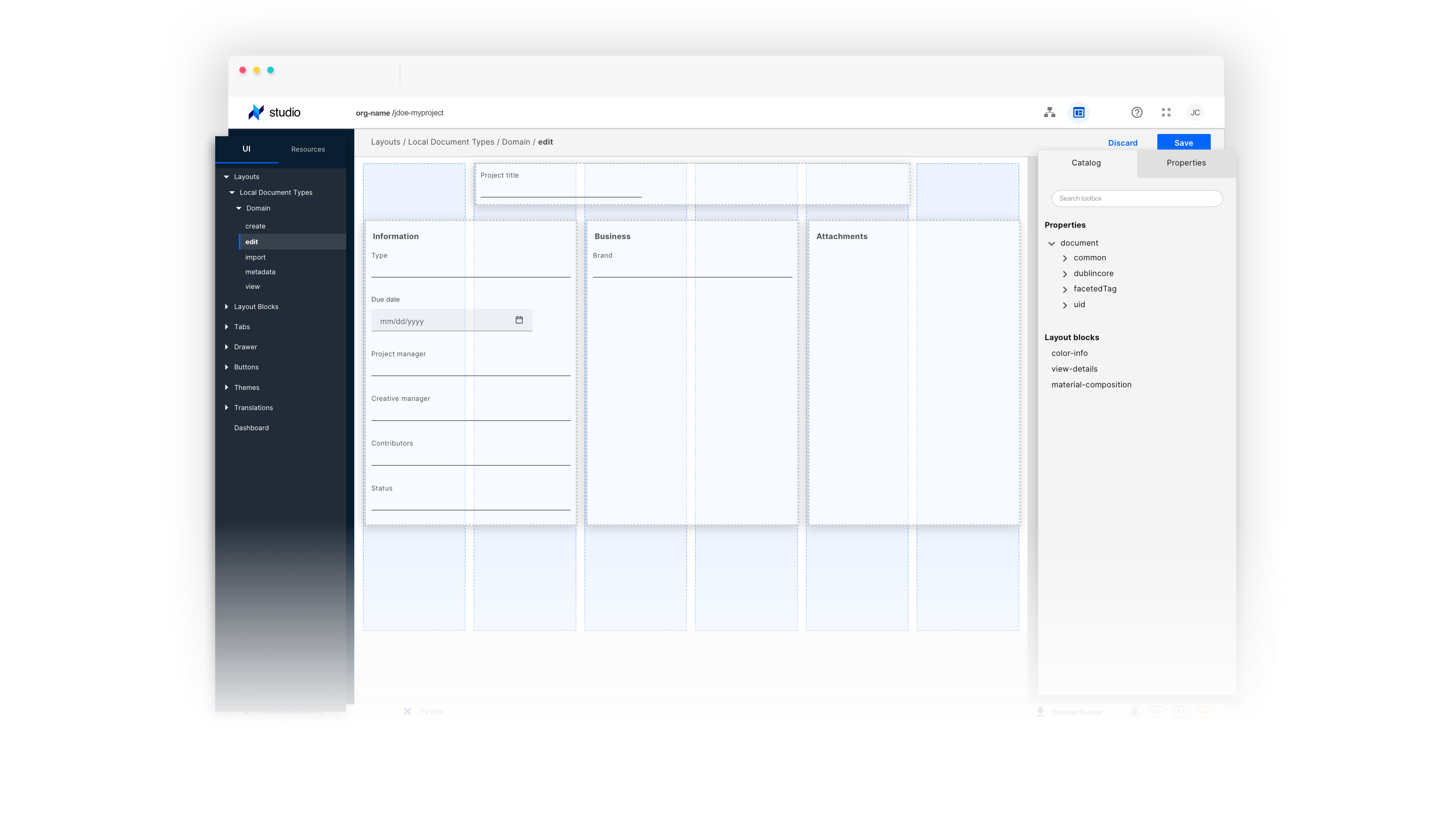
Our users were limited to displaying properties in a single column. When viewing, creating, and editing, particularly on a desktop, having all properties displayed this way does not allow efficient use of the screen's real estate.
Having to deal with large amounts of fields, and not every metadata needing to take an entire line, our users should be able to divide the layout into columns.
Define your layout
Conceptualize your application layout using a grid system. A grid baseline of 8px allows flexibility when scaling and defining your spacing without overloading the system with options. This provides the foundation for harmoniously and consistently positioning elements onscreen.
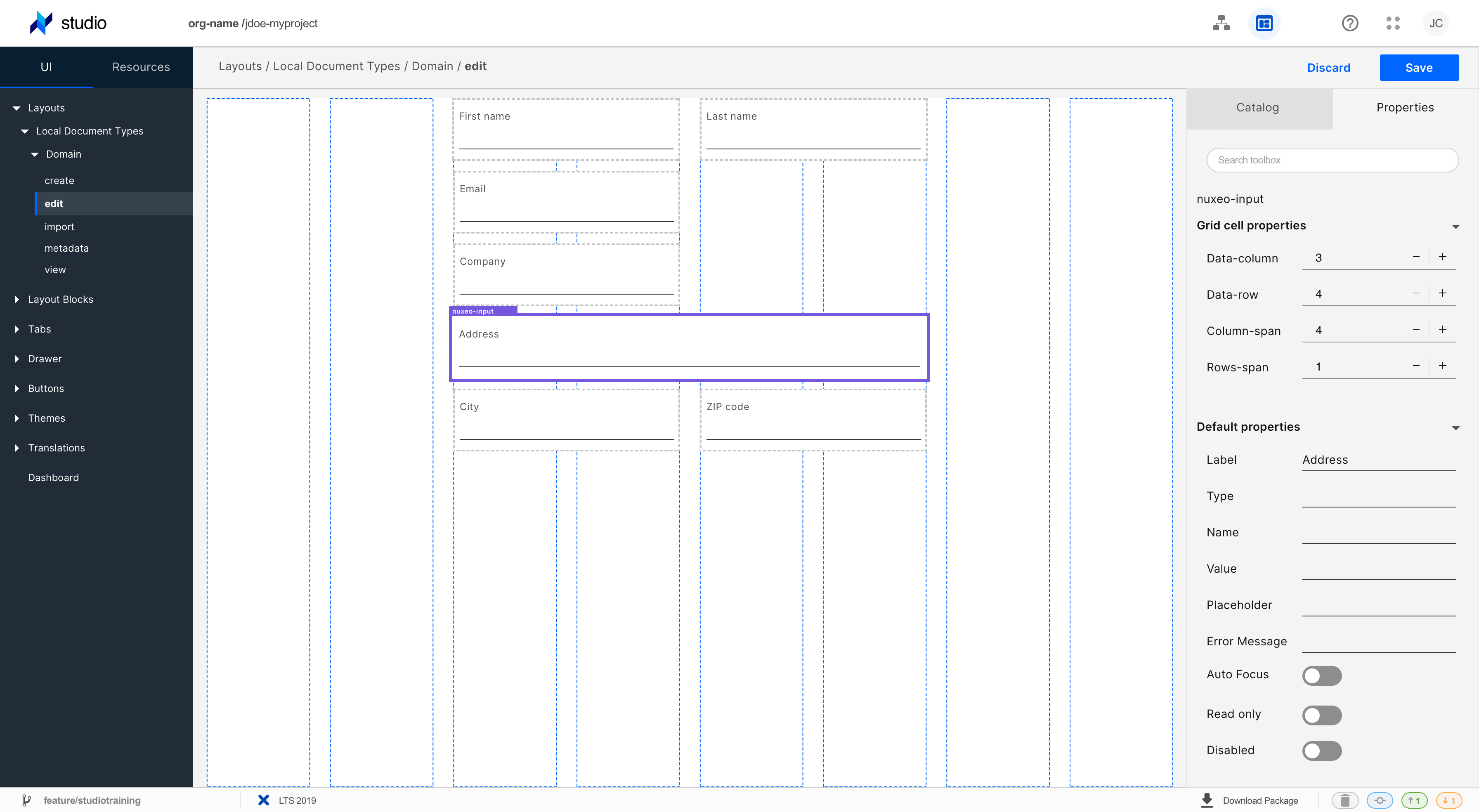
Correct spacing defines the layout
These spaces contain the composition and connect or disconnect the elements in such a way that associations are created between them.
Designing with the correct spacing is a real challenge, but maintaining the consistency of this spacing throughout the UI flow is even more challenging. The grid is the standard solution for this. The way it contains the elements create a proportional distribution and allows you to use use the proximity principle of Gestalt Theory to group them together.
Explore and Iterate
An extensive study on our competitors showed me that Studio designer was lagging behind in low code development SaaS. We were playing catch-up. Our users had had to switch to code to create simple things such as a layout with more than two columns. Therefore, not really taking advantage of our low code capabilities. My team was lucky to have access to a wealth of knowledge from Customer Success and Professional Services teams. Digging into all of the user feedback, we summarized the key user problems related to layouts.
How do users want to create layouts?
01. I want to have a different number of columns per row.
02. I want the width of the column to adjust to the content, and this way I should not have to configure it.
03. I want to group the content by columns, possibly by having a bigger space between them or with some kind of separator.
04. I want it to be as visual as possible so that I can understand what the result will look like, even if it's not perfect.
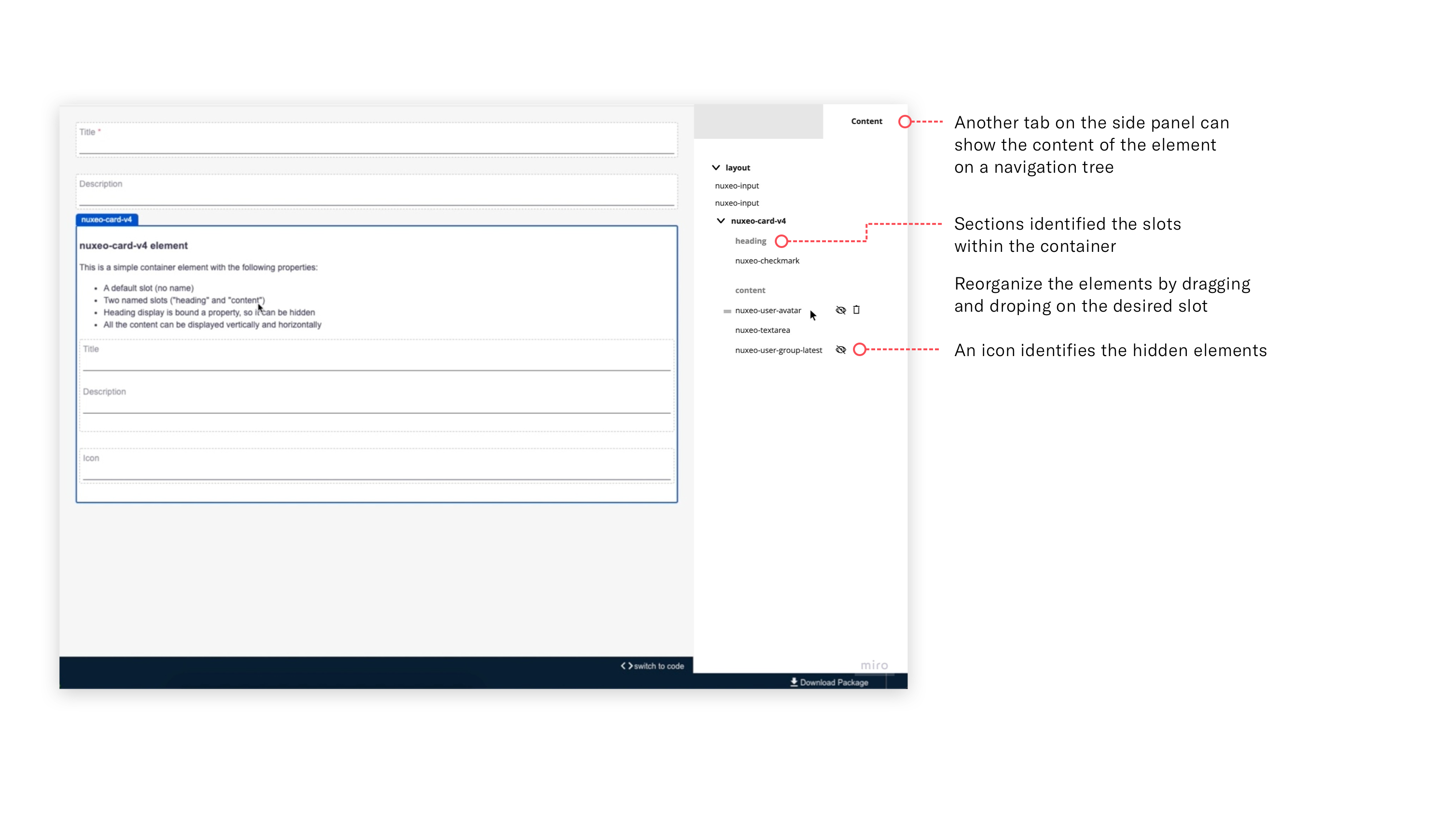
How and when to display a container’s slots?
How can we represent in which slot a given element is?
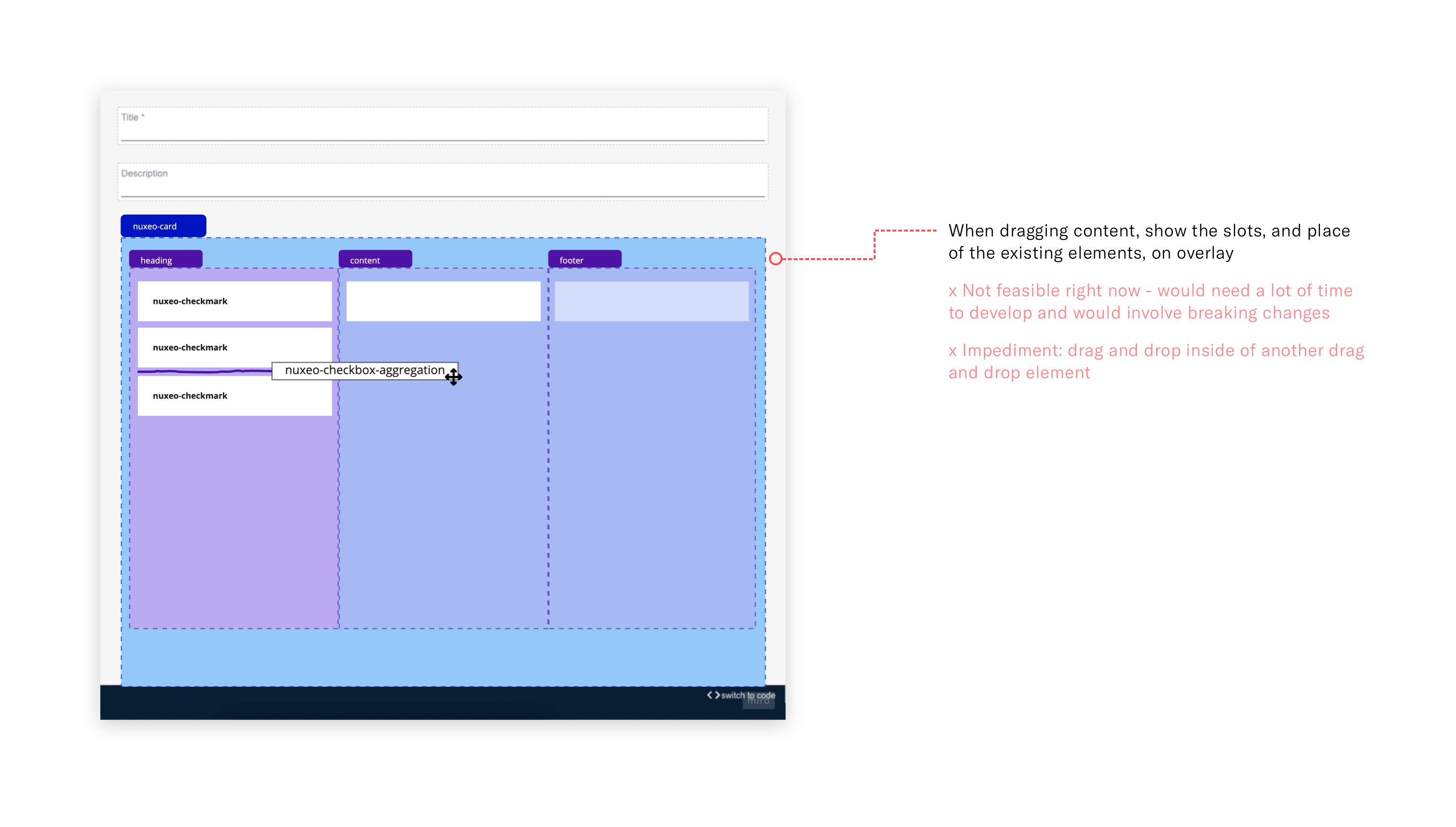
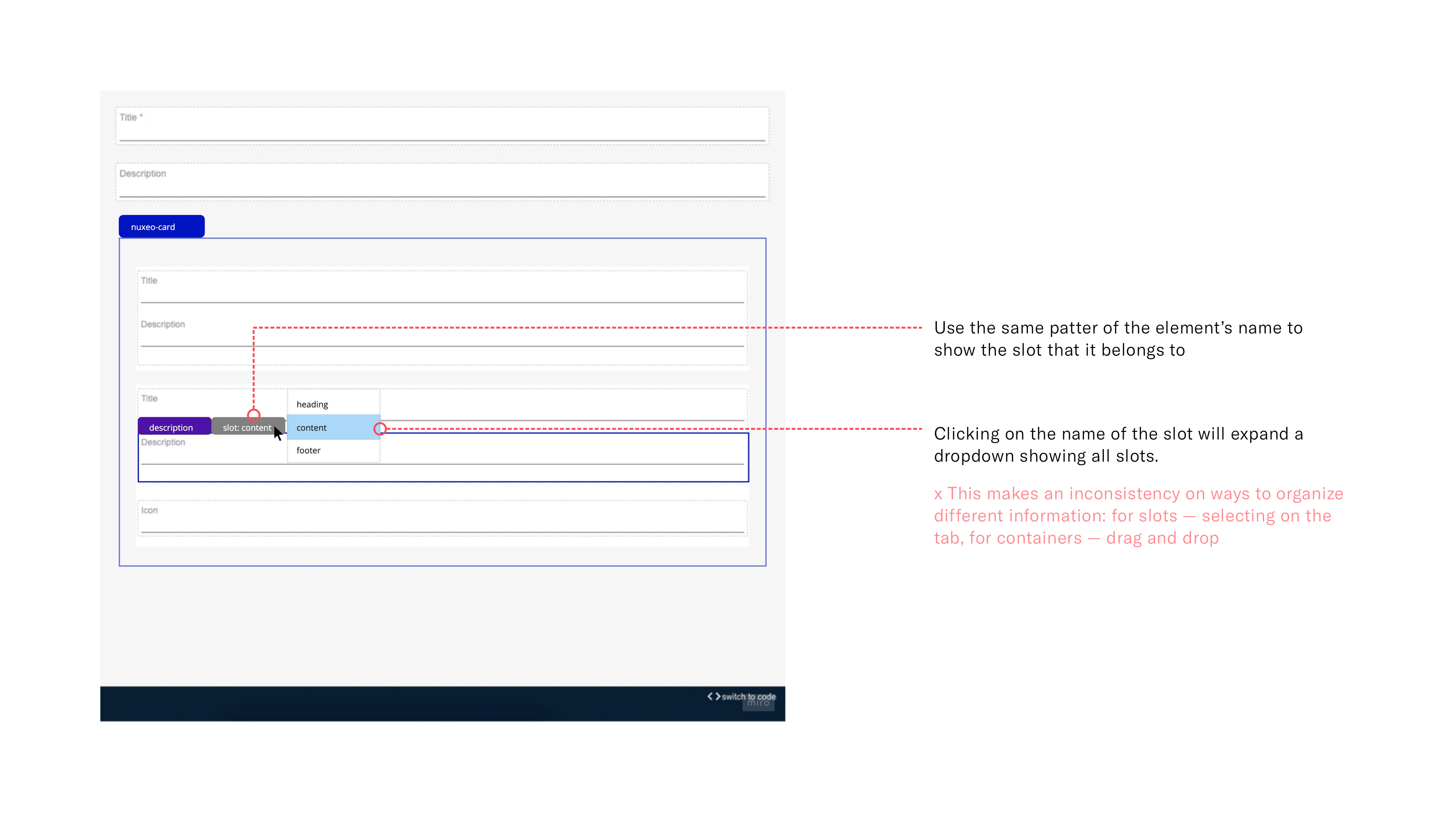
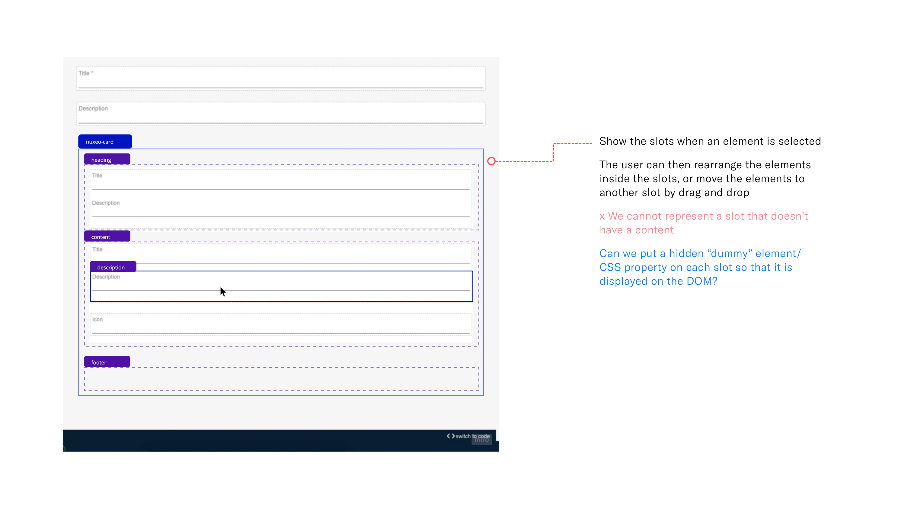
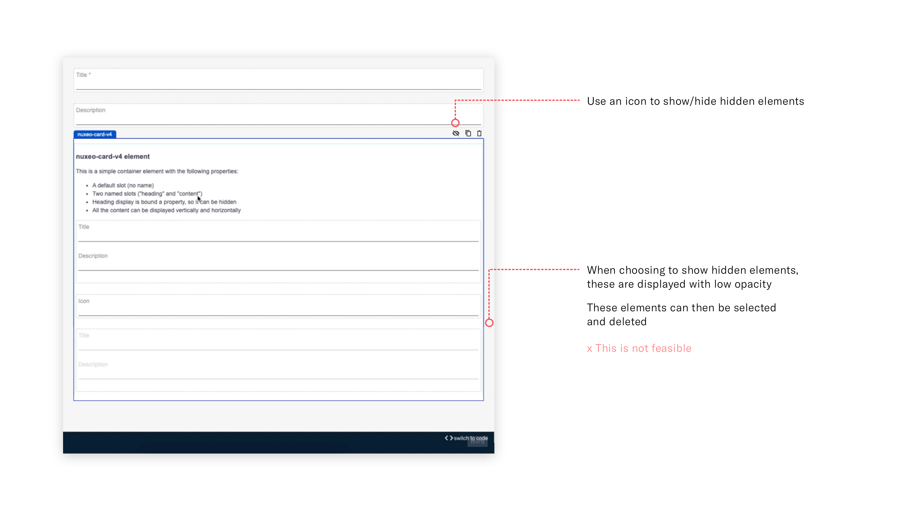
How can we represent an element that is on a slot, but that is not visible?
How can we interact with a slotted element that is not visible?
Carolina.mgouveia@gmail.com
Find me on LinkedIn ↗